


Claims
Morgan Alvarez
•
May 7, 2026
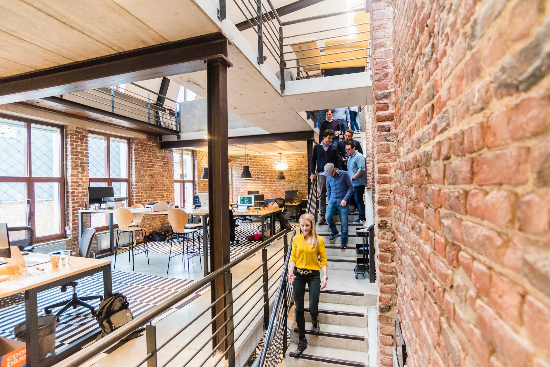
Claims Co-Creation Communities
Claims co-creation communities pair adjusters, contractors, and policyholders to redesign settlement journeys in 2025.
Continue Reading